

In our fast-paced world, students often neglect sleep due to academic and social pressures. Research highlights the severe impact of sleep deprivation on physical health, mental well-being, and academic performance.

As a Student Success Coach at The Office Of Student Financial Aid at UW-Madison, I've observed the challenges students face in maintaining a healthy sleep routine, impacting concentration, memory, and problem-solving skills. Many struggle with irregular sleep patterns and disruptions due to stress.
So as a UX designer, I was driven to address this issue by incorporating features that motivate and engage students to prioritize sleep, recognizing the role of well-designed user experiences in promoting positive behavior change.
💭 How might we encourage students with irregular sleep cycles to maintain a healthy work-life balance in college?


🔶 I began with brainstorming ideas that could possibly be the solution to my problem statement. These ideas I then categorized with the help of affinity diagramming.

🔶 Keeping in mind the time constraints, I came up with 3 realistic solutions and drew a very rough sketch of them:
🔸 A feature that gives basic activity reminders like drink water, stretch etc. between calendar breaks
🔸 A feature that lets you categorize work and prioritize them
🔸 A feature in calendars which will suggest a healthy sleep schedule based on your next day’s schedule

🔶 After a small feedback session from my professors and peers along with my research, I went with the following solution:
🗓️ A feature in calendars which will suggest a healthy sleep schedule based on your next day’s schedule
💬 Because this design solution seamlessly integrates with students' existing routines, providing them with personalized recommendations, promoting proactive planning, offering flexibility and customization options, and enhancing their awareness and education about the importance of healthy sleep habits. This user-friendly and practical approach aligns with the needs and preferences of college students, making it a compelling choice for the app's functionality.

🔶 After settling on a solution, the next question that faced me was
💭 How do I want my users to go about my app?
🔶 To address this question, I designed task flows for the main features that my app was supposed to have.
🔶 Next, I created wireframes mapping all the screens listed in the task flow to get a clearer picture of my solution.


🔸 To test out my wireframes and see if the task flows make sense to the user, I made paper prototypes for one of the flows and got some great feedback from my focus group of 8 users.

🔸 I'm a very visual thinker, so I decided to hashed out the visual branding of my app in order to make detailed prototypes in Figma.
🔸 I scanned the net for sleep tracker apps, meditation apps etc. and noted their design systems. I settled on a combination of mauve and mid night blue-ish as my color palette to form a calming sensation for my users. This should create less stress on user’s eye and make them feel cozy and comfortable looking at the app.

🔸 Then to match the theme of my idea I researched what typeface I should pick. Doing all this research has convinced me that the typeface Sans Serif works best if you want your site/app to be more readable. After experimenting with number of fonts I find the Sans family to be well spaced and sophisticated. Currently I’m hooked on PT Sans as my main font because it’s a very humanist style, looks minimalist and clear.

🔸 After settling on my visual branding I proceeded to make mid fidelity prototypes keeping in mind the feedbacks from my wireframes and paper prototypes.

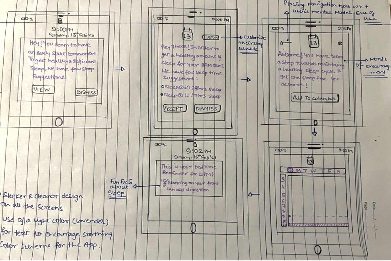
🔸 After subjecting my mid fidelity to another round of feedback from 9 users, I noted down key areas my design needed improvements
📌 Visual Hierarchy, Clear Buttons, Better Navigation, Mange White Space
I learned about Heuristics Evaluations from my UX professor, and thought it would be perfect for self evaluating my designs to make sure they are up to standard.
💭 Heuristic evaluation is like having a friend look over your work before you submit it!
🔸 I used Nielsen's 10 Heuristic Principles to evaluate my work and found the following major violations
🔸 Visibility of System Status
🔸 Aesthetic and Minimalist Design
🔸 Consistency and Standards
🔸 User Control and Freedom
🔶 Armed with my learnings from multiple round of peer feedback and heuristic evaluations, I designed the 1st iteration of my app's mock up with 3 main task flow


🔶 This initial mock up was again put through multiple rounds of user feedback and evaluations. Key areas of improvements included visual hierarchy, spacing and navigational system.
🔸Reiterating and Re-evaluating on the same 3 task flows which I used for drafting my initial mock up, I designed my final set of mock ups.
🔸It took numerous feedbacks, lots of research and a ton of trial and error to reach here but, here we are!


🔸 No UX Design project is over without interactions and animations!


Designing human-centered interfaces with a pop of color