
I designed Kahani's website and helped re-design the app's game interface, focusing on smooth user flows and making the experience accessible to all. This work led to a 40% increase in pilot sign-ups during the first few months, along with 90+ downloads and a growing waitlist of patients excited to try the app. I also collaborated on an 8-week pilot study with users from six countries, where we saw meaningful improvements in their mental health, including a 20% drop in eating disorder symptoms and a 23% reduction in anxiety levels. It was incredibly rewarding to see design and clinical research come together to create a meaningful impact.
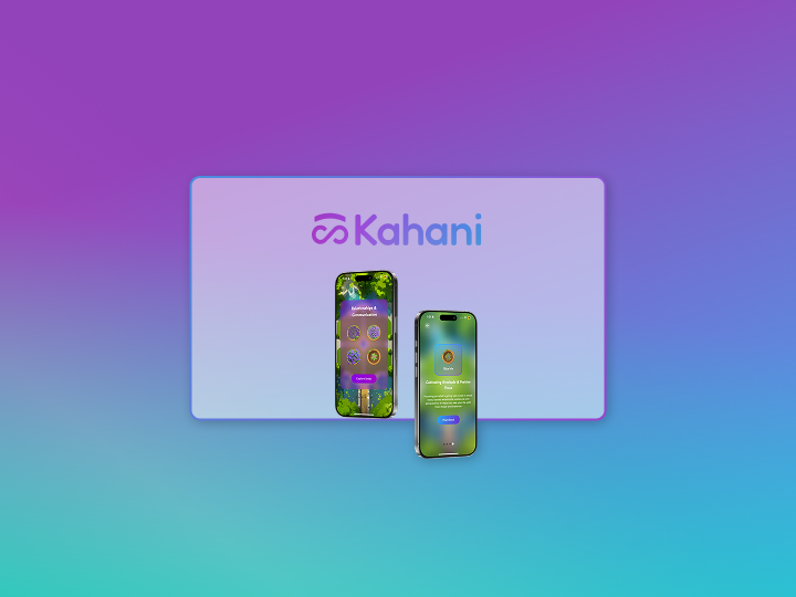
Kahani is a gamified mental health app designed for individuals navigating recovery from eating disorders that uses AI to support users between therapy sessions, helping to close the 167-hour care gap. It is carefully made in collaboration with Stanford clinical psychologists, Stanford business school and EDRC (Eating Disorder Resource Center). It's a game-world that provides structured, evidence based activities to help reframe thoughts and build sustainable coping strategies.
"It's like Inside Out meets Farmville meets Duolingo but for mental health.”
I was responsible for first designing a sort of MVP website so that we could start advertising our pilot program sign ups. Second, I was responsible for helping create the UI for the app's pilot version and analyze user feedback to create subsequent iterations. Using the feedback data we would then move on to improve the app's second pilot testing version which would then be user tested with 100+ users.
Kahani did not have any live website up so it was very crucial to have a website up and running as soon as possible to get the pilot sign ups rolling.
Expected deadline for the website : 1 Week
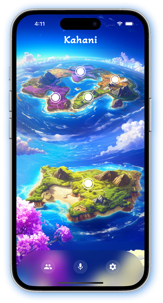
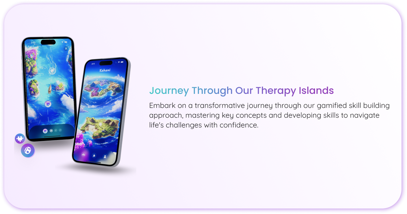
Kahani had a demo version which they used for technical testing with a small group of care providers and patients. The app had an island themed game where users would travel through fantasy islands by conquering a life skill. They had used the colors in the theme to design their logo as well. We decided to go ahead with this theme for the website as well.
I started by analyzing the exsiting brand identity
This color combination extracted from the app's theme was then mixed into a gradient and used as the color for the logo.
.png)
After this I wanted to understand how the founders what aesthetics they envision for their site. They were just 3 simple things
That's it! Nothing fancy so as to not overwhelm the users but still keep the essence of what we wanted to convey.
So here is how I decided to break the work down to meet the deadline -
3 days - Wireframing & Mockups : 1 day - feedback & content design : 2 days - feedback fixes & final interactions : 1 day - Review & handover
Due to the time crunch, I designed Lo-Fi mockups instead of basic wireframes so that the team had a clear idea of the direction I was thinking in.
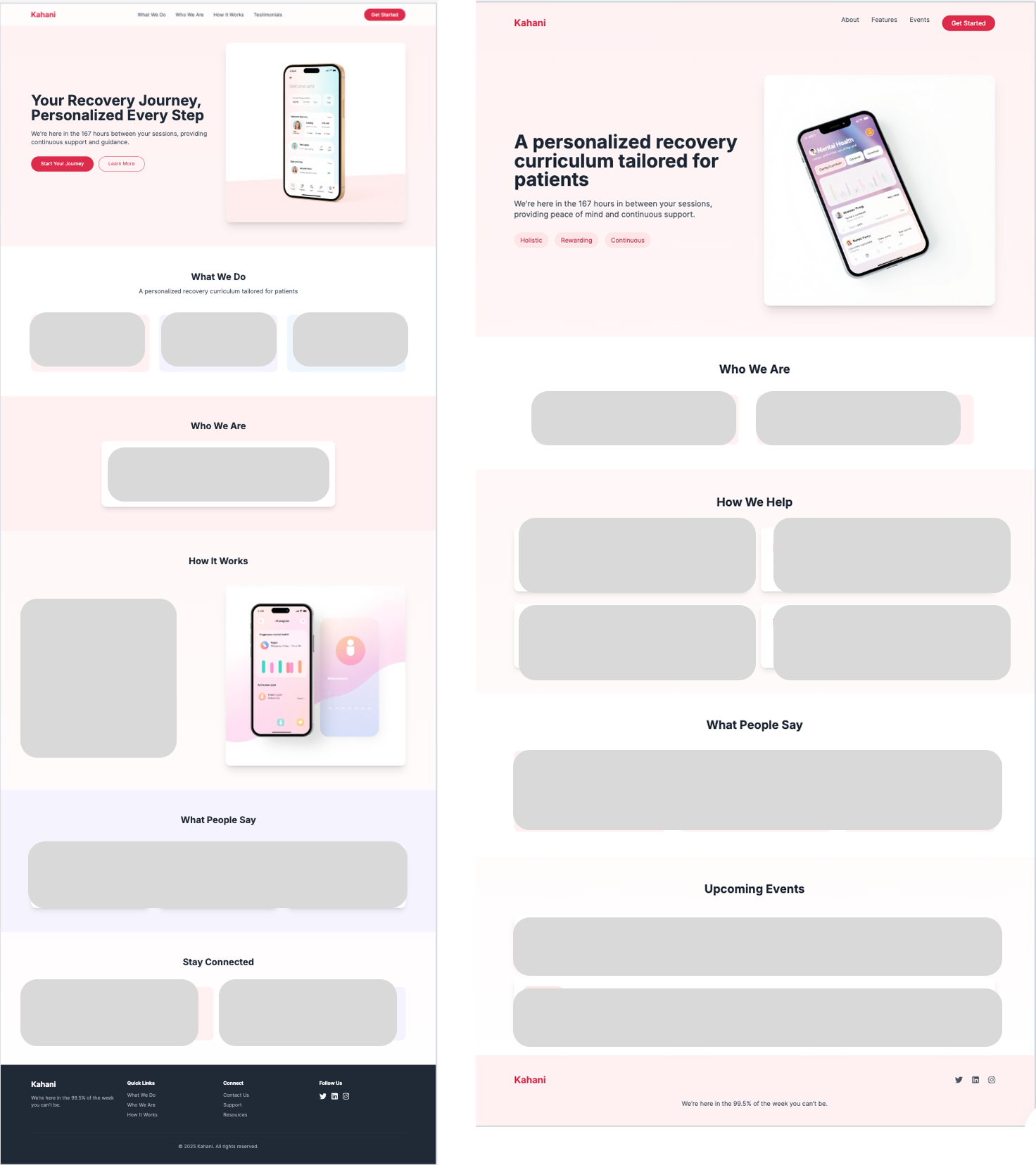
I used Figma and UX Pilot to create quick mockups so that I could get started with the Hi-Fi mockups. I designed 4 versions of the landing page mockup.
.png)
After having a discussion with the team we decided to go with the fourth mockup. The reasons being - clear call to action button, clean spaced out features section. Things that needed to to improved were to fix the content, add some scrolling effects and maybe reduce the space in the features section.
So I implemented the fixes and did some re-arranging to create a fifth iteration of the mockup -
.png)
However, when I began adding interactions the feature section still looked too spaced out and the animations weren't setting right. So I reverted back to the text being in a title/body format and put the app screenshots in device frames for a more refined look.
After this I finished it up with some interactions for the final submission.
This version was finally accepted and handed over for development.
The most crucial task as a UX designer at kahani was to create the app's UI and user flows. I worked on this task alongside the CTO of the company as we were the only two people who were working on the technical aspects of the app. I handled the design/research and he handled the codebase and business requirements.
The app had a demo version which was a fantasy island theme game. This version was used for technical testing and to make sure it adheres to the medical guidelines. The test group was small and controlled including Stanford psychologists for their professional opinions and a selected group of their patients. The paitients were selected based on their Eating Disorder Examination Questionnaire (EDE-QS) and Generalized Anxiety Disorder 7-item (GAD-7) scores.
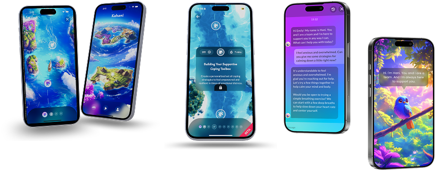
The game was to move through the islands by concurring basic life skills for ED patients. This demo version was successfully tested and got a lot of positive response for the AI chatbot we made.
But we had to make a theme shift. Why? Because some of our older patients felt this theme was too childish and they felt silly playing it.
A lot of ideas were floated around and discussed with our test group and the most voted theme was a Garden themed game.
The idea was the users would plant a seed and grow it into a fully grown flowering plant by the end of each exercise.
We used an AI image generator called Midjourney to generate images for our app's UI. We would then take those images and render it onto the app UI layer.
Here's the challenge! Generating images with an AI sounds easy, but I can assure you that it's not all roses. Getting Midjourney to generate exact images that you need, while being symmetrical and sometimes identical is a steep leraning curve!
It took us 1000s of generations and edits to finally get the background we needed , which would be the base of our garden layout and style.
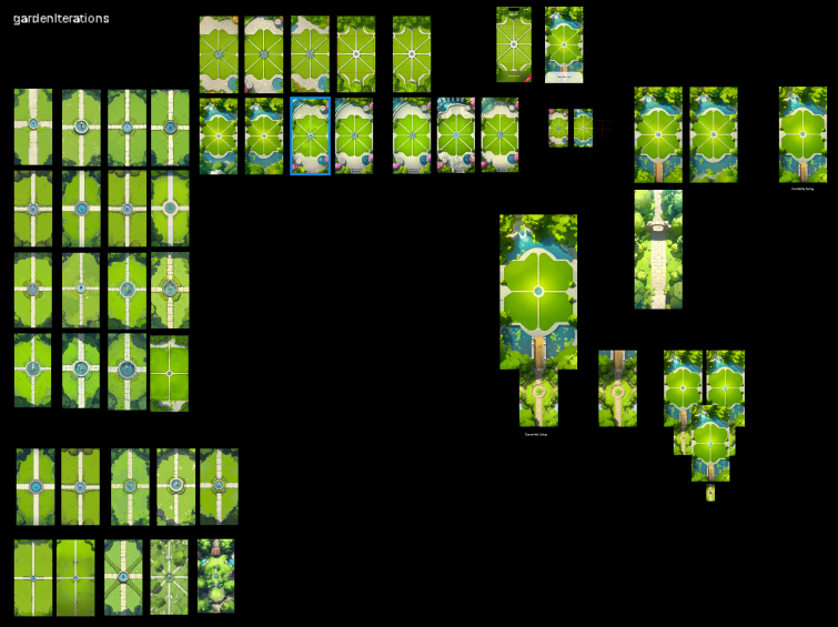
We experimented with a couple of garden layouts to see which one sets into a grid perfectly. A grid was important to make sure users are able to plant their pots and plants in a symmetrical manner and also just to define tap targets in general.
At first we tried a layout with 8 sections so that the users plant in small chunks and are not overwhelmed by seeing large free area.
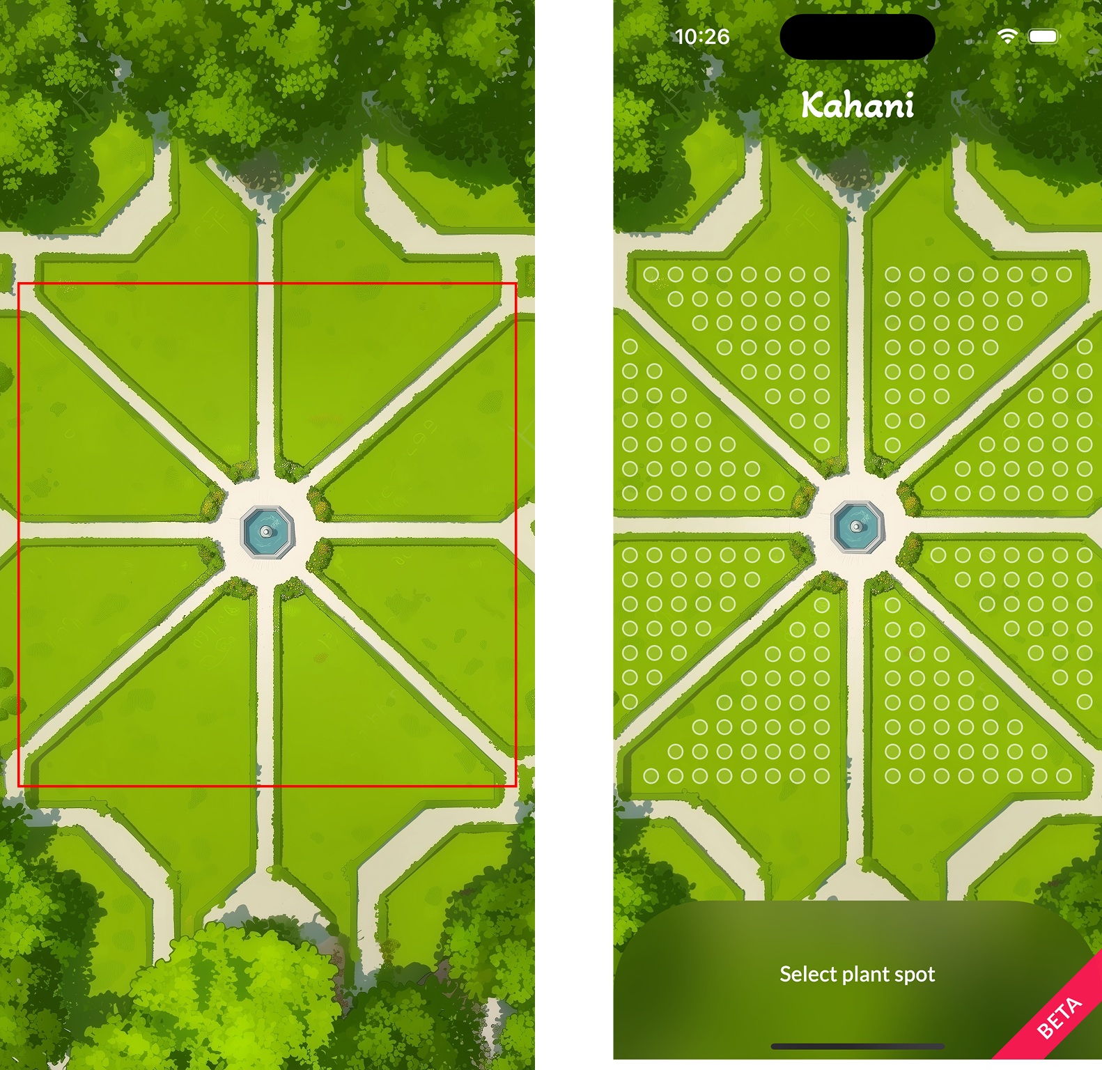
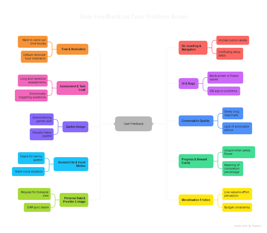
Eventually when we rolled out the app for testing with this garden design we got some interesting feedback -
So in order to fix this, we brain stormed some more ideas and generated a fresh set of images. We went for a fancier garden style with four sections.
.png)
The entire grass area is the user's tap target, this also makes sure that the users are not confused about where to click. It's zoomed in and has ornamental stuff like water features, bridge etc. This layout was well received by our test group and thus was finalized for our pilot app.
Similar approach was used to finalize other elements of the game as like pots, plants and flowers. The visual reward for the user is to see the growth of a plant from seed to a flow bloomed flower. So we had 3 stages for each flowering plant, Sapling -> mid-size plant with buds or half bloomed flower -> full grown plant with full bloom.
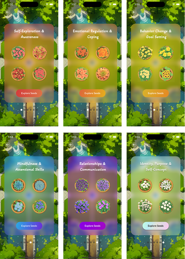
We had 6 colors of flowers each indicating a life skill and 4 unique species of flowers for each color indicating the exercises to champoin each skill.
That's 72 pixel perfect game components and 1000+ Midjourney generations!
Here are few examples to help visualize the UI
I created this UI in Figma using the images generated from Midjourney. This screen is from where the user can select which skill they would like to practice. once they select a skill, they can then chose from the four seeds that they would like to grow.
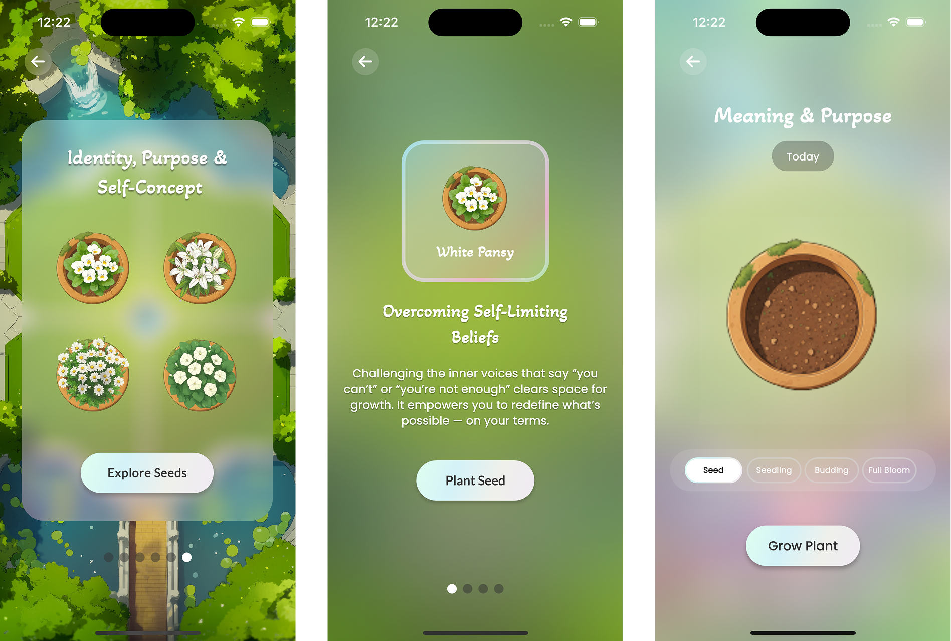
Once they choose a plant whose seed they'd like to sow, they will the go through the whole plant growth stage which are mapped as mini-assessments.
The idea is to have a vibrant garden filled with colorful flowers at the end of their journey.
Due to the nature of our app, rigorous testing and detailed feedback was most crucial. We could not afford to get anything wrong!
For our first pilot program we had 34 participants from 6 different countries for a period of 8 weeks.
Our participants were selected on the basis of their GAD7 and EDEQS scores, range of which was pre-approved by our collaborators at Stanford Medicine.
We used User Interviews and User Surveys as our testing and research methods.
Interviews were taken every 2 weeks and the purpose of it was to understand user's feelings about the app like what is working for them/what is not, what encourages them to open the app/what does not, UI specific questions, has kahani helped them in anyway, etc.
Surveys were sent out at the end of every week to keep track of their GAD7 and EDEQS scores to access the impact of Kahani on their diagnosis.
At the end of 8 weeks, I sat and summarized the intense feedback we had gotten. I used an AI tool called Napkin AI for data visulaization.
.png)
.png)
And lastly we focused on what they would like to see in the next version of Kahani's pilot program.
.png)
Our surveys and analysis showed that on an average our users engaged for 7+ minutes and saw a 23% reduction in their GAD7 score and a 20% improvement in their EDEQS score!
Based on this initial idea and results from our pilot program Kahani raised it's PRE-SEED ROUND!
This was a huge boost to our efforts and a great motivation to keep moving and changing the landscape for people with eating disorder!
Stanford Daily did a fantastic feature on Kahani outlining these results and an interview from our CEO which you can read here.
With such promising results from the first pilot, we had enough motivation and data to go on for our next pilot version.
In our discussions we aimed to fix/resolve 100% of the core problem areas and address 98% of the desired features area.
But the key problem/challenge still remained -
How to make the garden game feel less overwhelming, empty and more personalized, inviting and interactive.
The answer was in our feedback analysis, Garden Personalization!
So we started brainstorming ideas to make that happen in a way that it was pleasing for the users while being technically feasible for us to build n time.
A colored coin based shopping experience. What happens here is, we already have 6 different colors of flowers that represent 6 different life skills for the users. So if a user chooses to do a Red colored skill assessment, they will get red coins for completing that which they can then use to buy any red flower from the red themed shop.
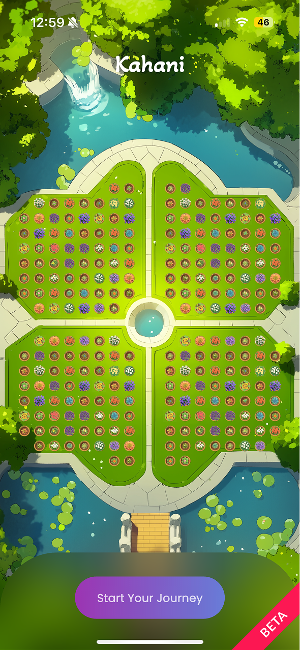
To make it feel more personalized for the users we also decided we'll add garden decorations which users can buy and add to their garden to make it feel more personal to them. So I started designing the shop and a new garden layout.
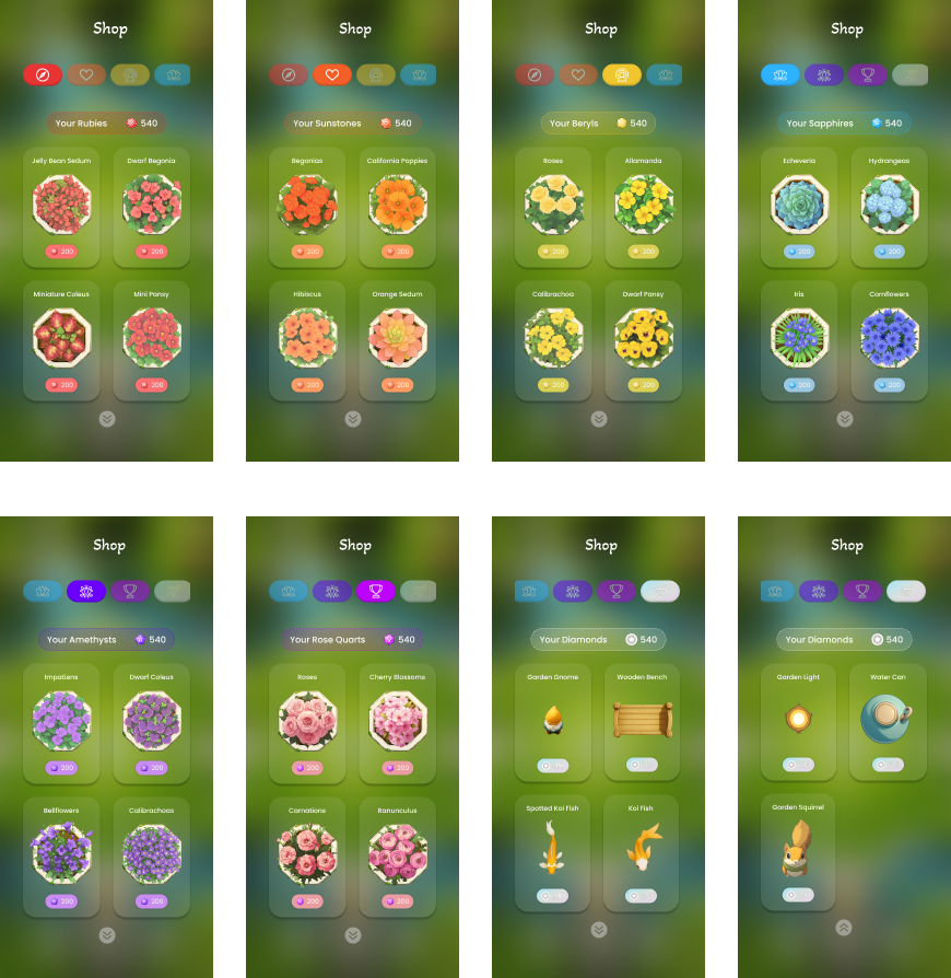
Along with the shop I designed the skill progress dashboard so that users can keep track of their assessments and tasks.
Here's a short demo of what we re-designed -
At the time of writing this case study, the second pilot version is still under development and the testing is yet to start!
Working on Kahani deeply expanded not just my design skills, but my understanding of empathy, behavioral health, and cross-disciplinary teamwork. Collaborating with clinical psychologists taught me how design decisions could tangibly support users’ emotional journeys—sometimes something as simple as a color or a microinteraction made a real difference in how safe or motivated someone felt.
I learned how iterative, user-centered research can lead to better outcomes when working on sensitive topics like eating disorders. Testing ideas with real users—and adapting based on their feedback—pushed me to balance innovation with accessibility, always aiming for solutions that felt gentle and clear.
The experience also reinforced the value of merging technology and compassion. From leveraging AI to bridge the gaps in care, to structuring playful, gamified experiences, I saw how thoughtful design can amplify clinical impact. Most of all, I realized that the best results come from close collaboration—listening, sharing, and co-creating across disciplines for meaningful change.
.png)
Designing human-centered interfaces with a pop of color